Issue 27
Palette consistency is not an end in itself
Last night while watching The Young Pope I noticed that they'd included a freeze frame of some dancers in episode 8.
I thought it was out of place. As far as I remembered, there had been no other freeze frames in the show so far. In fact the whole work has a few oddities of that stylistic type - for example, there are one or maybe two dream sequences with this intense pile of babies, and it’s not a show with a whole lot of grotesque imagery.
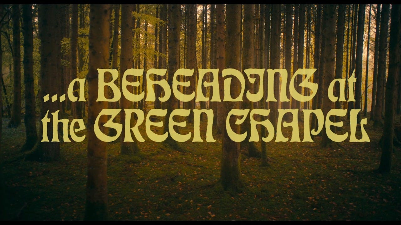
A comparison case might be The Green Knight, which is on one hand consistent in its medieval-looking title cards…
… but on the other hand inconsistent because the typography changes.
They don't stick with one font or font color or shot framing, and the fonts are similar but not identical in vibe.
I’m drawn to tight, decisive palettes. I like intensity. I like keeping a very clear palette across the vibe reels, for example at least re the title cards, shortness of the clips, etc:
And here you can see that in season 2 of my talk show I got tighter with the palette:
I'm reminded of Mishima's line that he wants “to make a poem of his life”. Artistically speaking, it’s pretty Japanese to make use of an extremely narrow palette. Palette consistency demands decisiveness and choice, which as far as I can tell is crucial for an artist.
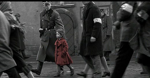
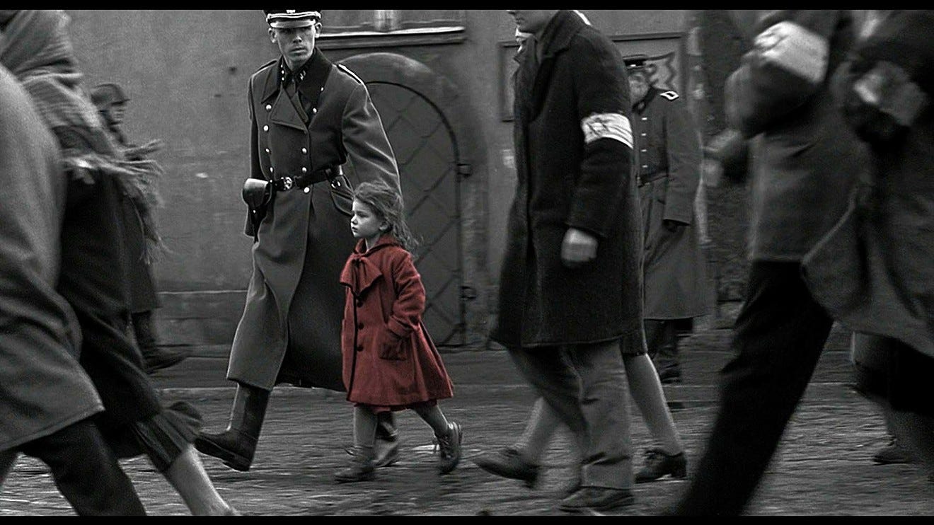
Overly broad palettes with uncontextualized elements feel messy or confusing; the palette is for guiding the viewer into the language of the work. Narrowness in the palette can create intensity, like a single splash of red on a white and black background.
On the other hand, as a matter of practical reality, I've witnessed myself trying to stick to extremely consistent and narrow palettes, and becoming frustrated when I can't find or create the elements that will let me maintain that consistency. The truth is that flexible palettes with a certain kind of meta-consistency can work too; discovering each new font in The Green Knight was punchy and fun. The mutation offered a variation on a theme that deepened the palette’s language, rather than confusing it.
Long story short: palette consistency can be a source of power, but isn't an end in itself. Most important is to understand the role of the palette and tune it to your purposes.


